BodyFlow rebrand
BodyFlow studio
2021
visual identity, branding,
Bodyflow is an aerial sports studio based it Limassol Cyprus. It’s a place that challenges the body to develop strength, mobility and stamina whilst also providing a unique method of self expression and exploration.
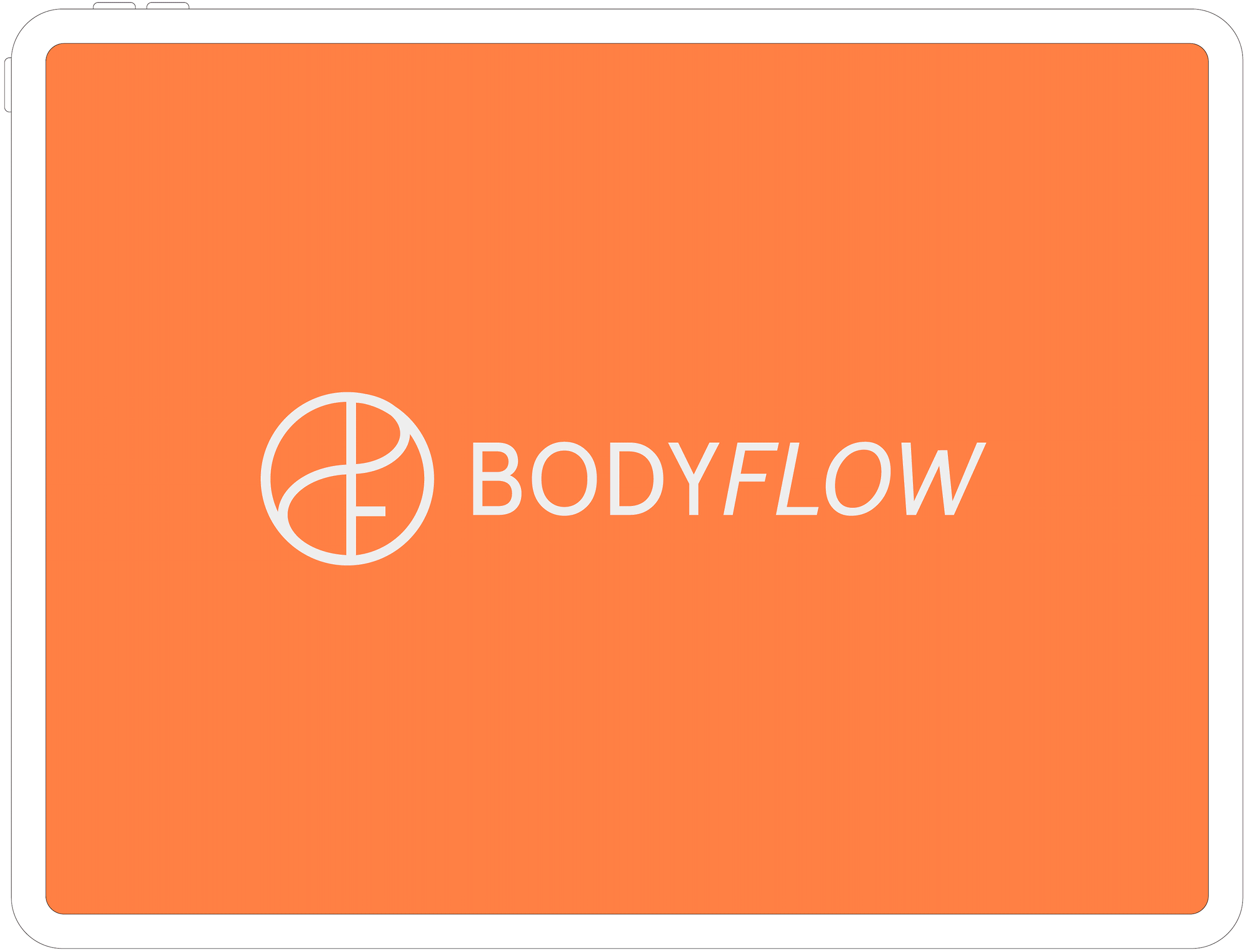
The redesigned identity maintained the necessity for a core symbol that would represent the studio. Read in various ways the new symbol maintains fluidity – Flow – representing the core of all practices. The letter ‘F’ is the 1st and most visible element in the composition while ‘B’ is more abstract in its opened up form, as if performing a split, also resembling a silk ribbon. The hoop is represented by the circle which combines all the elements while the central line from which the letters are also formed represents the pole. The ying yang like shape formed by the various elements indicates balance.
Visual Identity: Despina Kannaourou
Creative Direction: Despina Kannaourou,
Constantinos Hadjidemetri
Illustrations: Constantinos Hadjidemetri